VoID Gaming - An E-sports Platform

Year
Client
Services
Project
As part of Void Gaming’s brand overhaul, I led the redesign of their visual identity to replace an inconsistent, generic logo—previously sourced from stock imagery—with a custom, meaningful mark. The absence of a distinctive brand symbol made it difficult for the team to establish a recognizable presence in the competitive esports space. Drawing inspiration from the concept of a black hole, I created a bold, minimalistic icon that conveys dominance, mystery, and gravitational pull—qualities that align with Void Gaming’s competitive edge. Paired with strong, futuristic typography, the new logo creates a cohesive, scalable identity optimized for digital platforms, merchandise, and in-game representation. This rebrand not only elevates their professional image but also strengthens brand recall and community connection, positioning Void Gaming for greater recognition and engagement within the esports ecosystem.
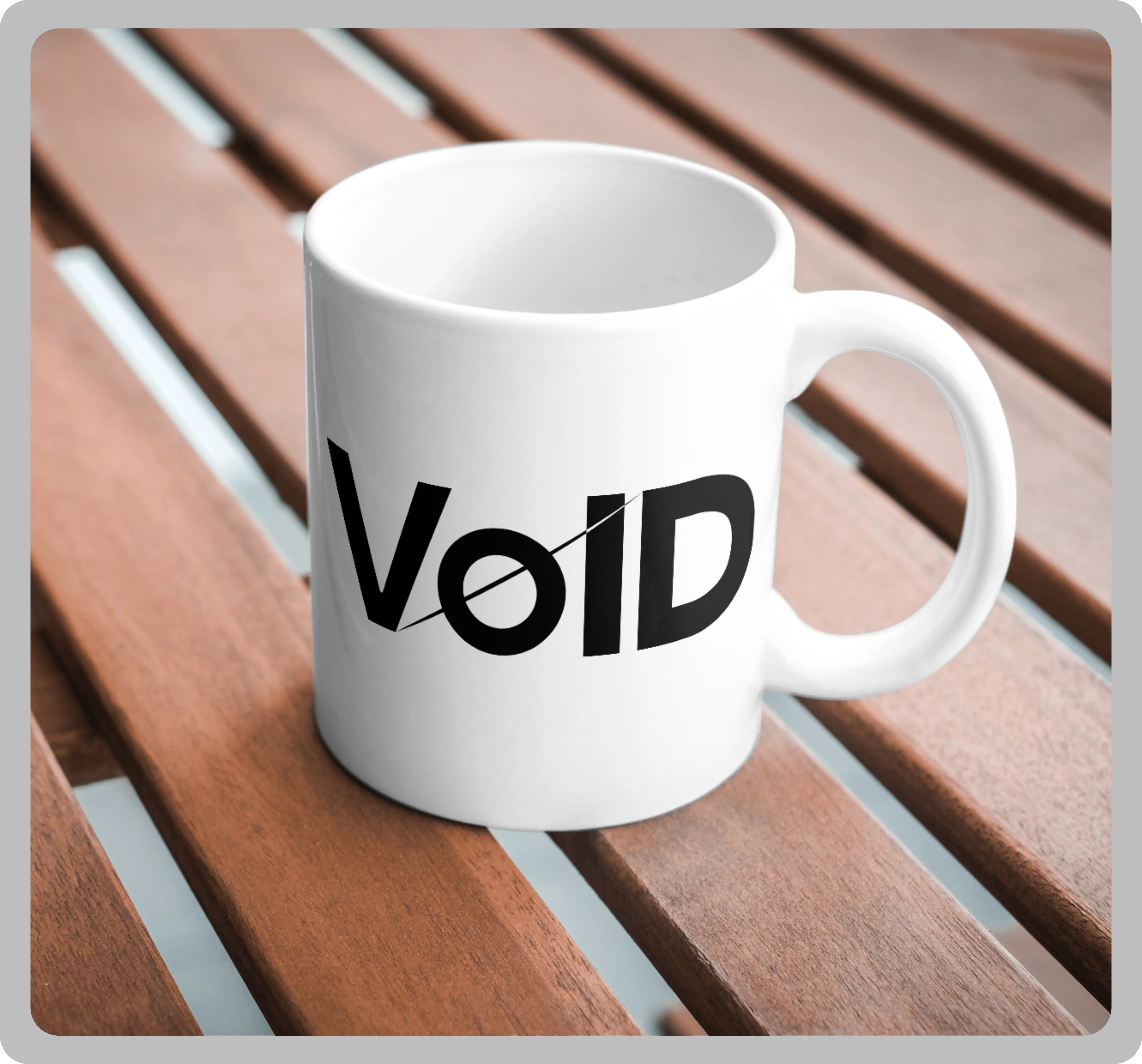
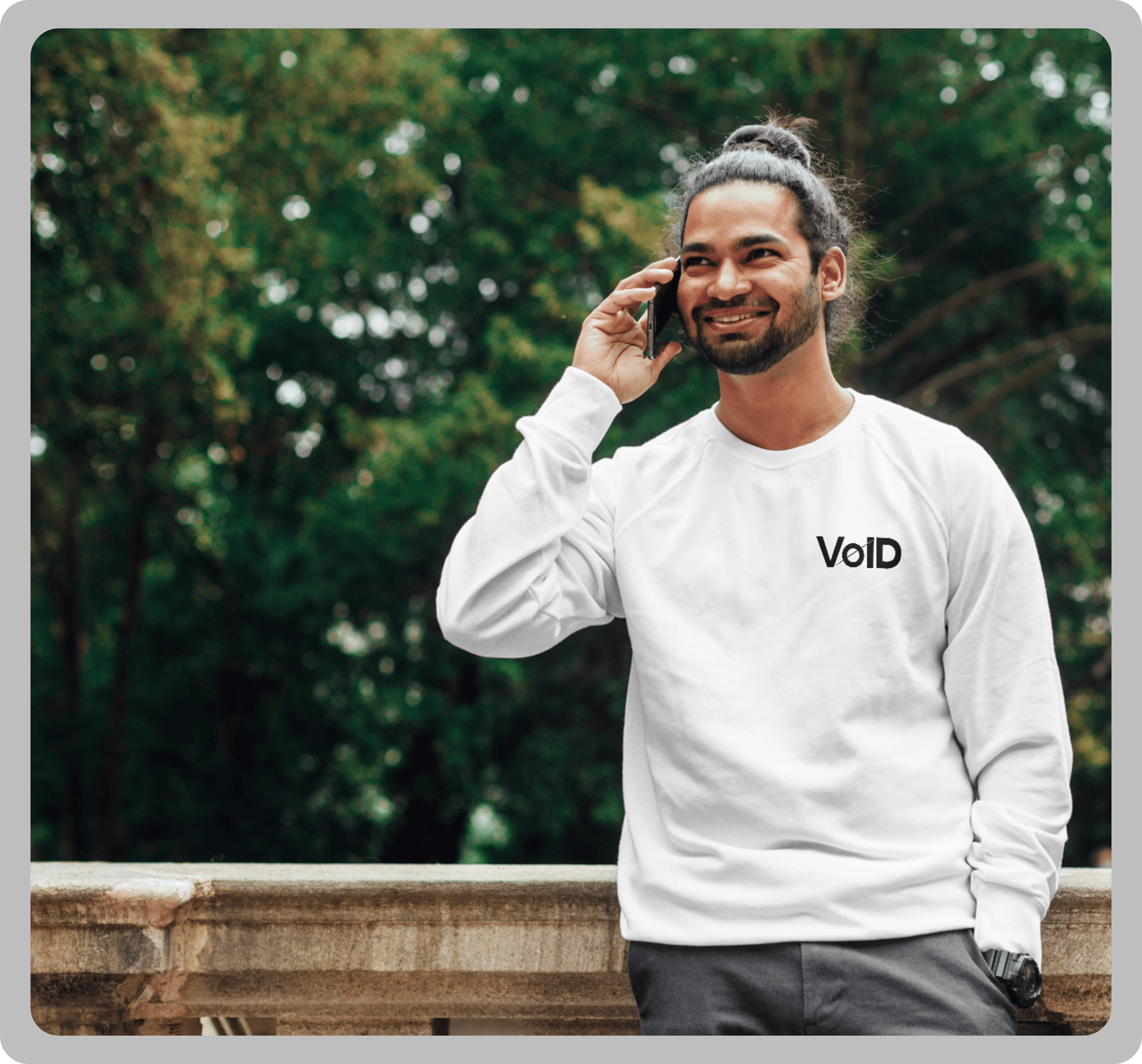
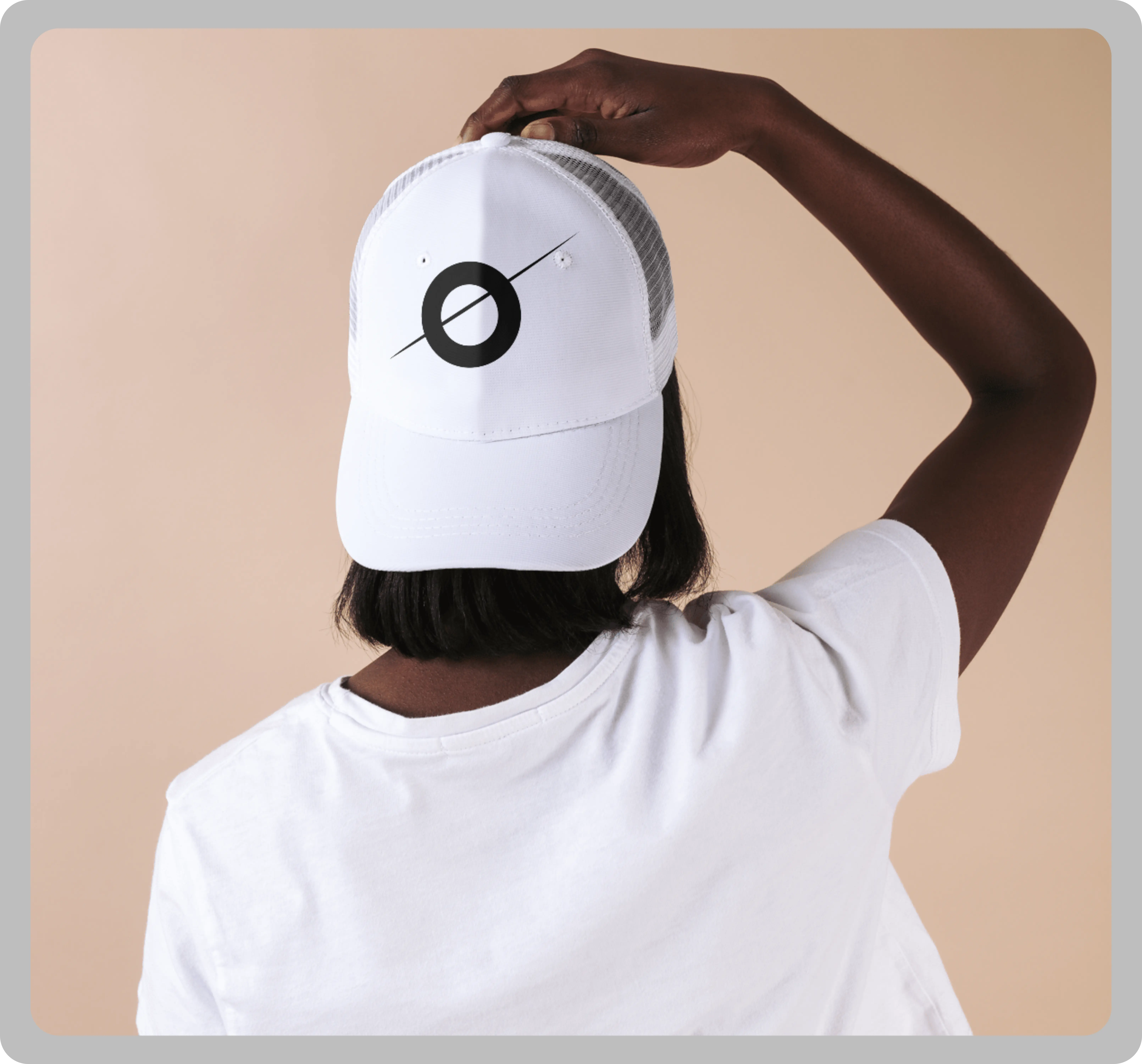
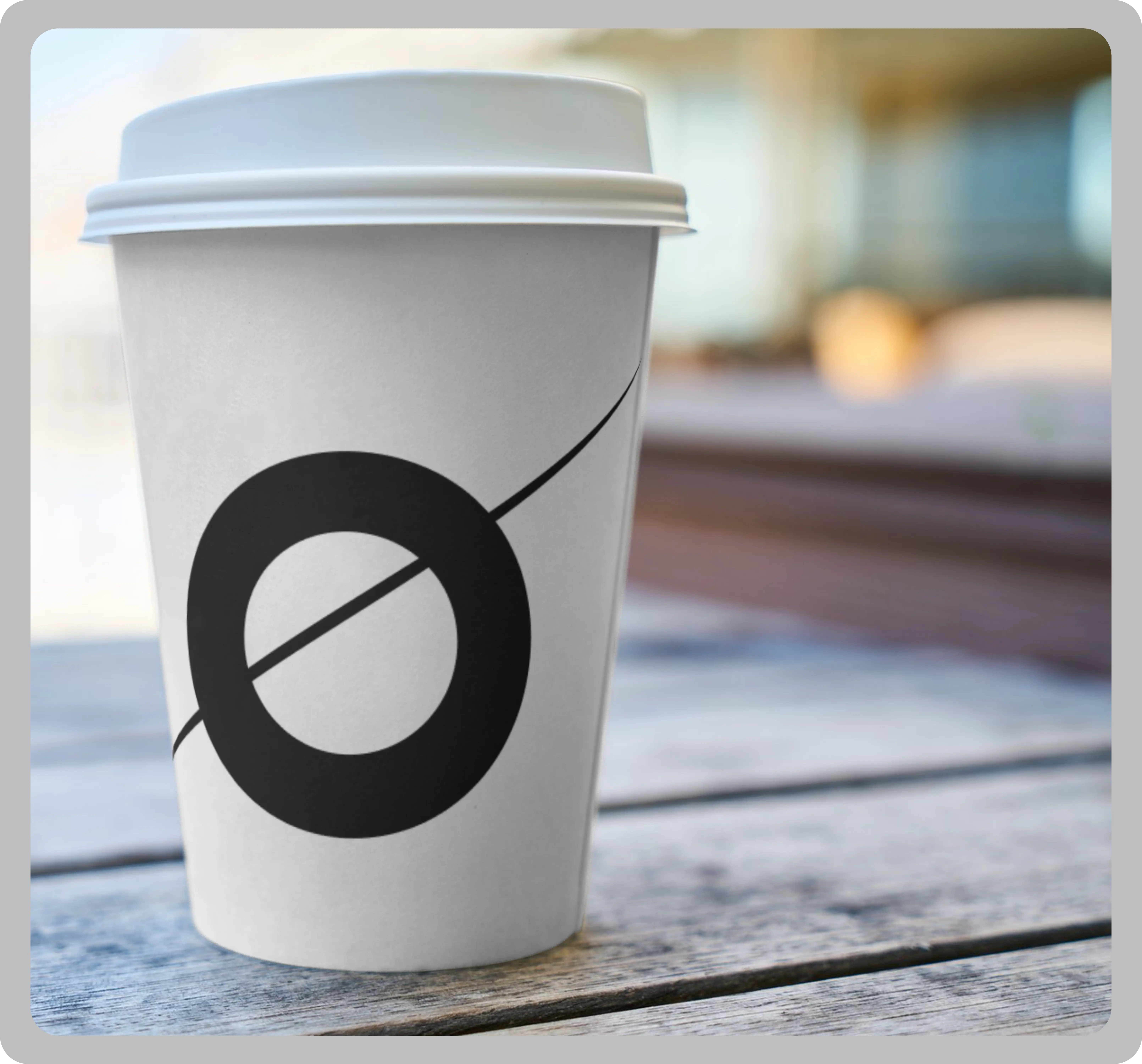
The main icon — a circle with a diagonal slash — represents a black hole, rendered in a sleek, minimalist style. This isn't just a scientific metaphor — in gaming, this could signify a “point of no return”, like entering the final boss arena or diving into a one-way portal. It's the void that pulls everything in, just like how an elite esports team pulls in attention, fans, and victories.
This slash through the void also evokes a crosshair or slash effect, common in FPS and combat games, hinting at precision, aggression, and motion.
The strong, simple form is reminiscent of iconic esports team logos (e.g. FaZe Clan, Sentinels) — bold enough to be easily recognized in-game, on streams, or on player jerseys.
Just like a black hole consumes all matter, Void Gaming dominates the competitive space, swallowing up opponents with skill and strategy.
A nod to late-game snowballing — once Void Gaming picks up pace, there’s no escaping the pull.
Similar to how players fear entering dark, unknown zones in games, the name and symbol invoke a sense of awe and intimidation — "What happens when you face the Void?"
🔤 A nod to late-game snowballing — once Void Gaming picks up pace, there’s no escaping the pull.
🔤 Wide Letter Spacing gives it a cyber-futuristic vibe, like title screens or clan logos in sci-fi or shooter games.
🔤 The clean type pairs well with high-contrast overlays during streams, tournaments, or in-game branding.
🎨 Black (#000000) is dominant — and not just to match the black hole theme: In gaming, black symbolizes elite-tier status, stealth, and deadly precision
🎨 It keeps the design clean, dramatic, and flexible — essential for digital and physical branding.
🎨 Matches well with RGB accents, glitch effects, or animated transitions for stream overlays and highlight intros.
Whether it’s an overlay on a live Twitch stream, a spray logo in an FPS game, or merch like jerseys and keycaps, this design scales and translates across formats effortlessly.
Thematically, it could also reference in-game voids or zones (like The End in Minecraft, Voidwalker class in Destiny, or Zed’s shadow realm in League of Legends) — always mysterious, elite, and high-risk/high-reward.
The circle icon alone works well as a favicon, Discord server logo, or controller decal — instantly recognizable even without the wordmark.
Check out some of my design projects, meticulously crafted with love and dedication, each one reflecting the passion and soul I poured into every detail.
Reach out and let's make it happen ✨. I'm also available for full-time or Part-time opportunities to push the boundaries of design and deliver exceptional work.